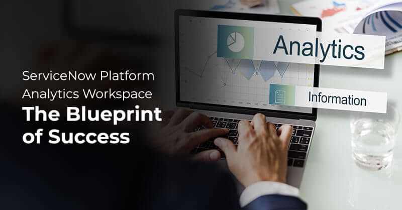
The Blueprint for Successful ServiceNow Platform Analytics workspace

Written by Harini Krishnamurthy
Manager – Content
January 2, 2023
The business environment has never been more complex or competitive. Data is becoming increasingly attainable; however, most organizations still do not understand how to get value from it. Static reports with stale information and no context are presented in weekly status meetings while participants question the validity of the source data. When it does exist, analytics is often siloed away from stakeholders and departments who need those insights to drive meaningful change.
Organizations strive for service excellence and rely on visibility into process performance. Several ServiceNow applications, such as Performance Analytics, Process Optimization, Reporting, Benchmarking, etc., play a key role. However, in some cases, organizations are unsure what to expect from these applications, if they overlap or complement each other, and how to deploy them. The best way to help understand the added value of these applications in supporting service excellence is to look at it from a continual improvement viewpoint.
The ServiceNow Tokyo release brings a new workspace to explore – PLATFORM ANALYTICS WORKSPACE! That’s right, reporting and dashboarding were very EASY in the classic user interface. With Tokyo, ServiceNow brought that same intuitiveness, more data Visualizations, and easy-to-configure capability to the Next Experience.
What Makes it Different?
Integrate data visualization and analytics functionality into the workspace experience. Subscribe to notifications about behavioural process changes. Explore KPIs and get answers and insights on analytics.
Key Highlights
Within the Platform Analytics Workspace, you can:
- Ask a natural language question and be shown the relevant analytics in an on-the-fly visualization.
- View any Next Experience dashboard you own, or that has been shared with you.
- Create and share dashboards and data visualizations from your workspace runtime.
- Drill down into your KPIs, applying filters to slice your data and applying aggregations and statistical tools.
- Build data visualizations for any data source in a single place.
- Create and consume configurable workspace dashboards with a unified filter and flexible configuration.
Features
Create, Edit, and Configure Configurable Workspace Dashboards
Use an inline editor to create and edit configurable workspace dashboards quickly and easily. Users with a role can use this editor to work on their dashboards in runtime. This inline editor is included in the Dashboard page template. More technical users also have a powerful and feature-rich technical editor that brings dashboard construction functionality into the UI Builder.
Configure Visualizations
Configure a new data visualization if you cannot find the visualization you want. You now have an inline visualization editor to create and edit data visualizations quickly and easily. You can even seamlessly create these new visualizations while editing a dashboard. Any user with a role can use this editor. You can save your visualization to the shared library with the right roles.
Dashboard, Visualization, and KPI Libraries
You have a unified experience for searching and viewing reusable, configurable workspace dashboards, visualizations, or indicators. Search and view reusable visualizations for multiple workspaces or dashboards: bookmark visualizations or filters on those shared with or created by you. Unfortunately, you can only browse the dashboards from every configurable workspace in Platform Analytics Workspace.
Certify Configurable Workspace Dashboards and Visualizations
Administrators can mark selected configurable workspace dashboards and data visualizations as certified for use across a department or organization. You can filter on certification when browsing through dashboards or visualizations.
Export Data Visualizations
You can export a data visualization from the Visualization Designer as a PDF, a PNG, or a JPEG file. Use this feature to build presentations, share the report with users of the instance, or keep old reports on different versions to track progress.
See Data Visualization Usage
Use the data visualization details pane to view all dashboards that contain the visualization. Furthermore, when you save or delete a visualization, you are warned of which dashboards contain the visualization and prompted to confirm your action.
Include this Workspace's Features In Your Configurable Workspaces
In the User Interface (UI) Builder, use the Analytics Centre page template to include the features of the Platform Analytics Workspace in your configurable workspace. You can also create a workspace with these features in the App Engine Studio. However, only the Platform Analytics Workspace lets you view dashboards in all the other workspaces.
Experience New user-friendly UI
New Visualization Types
Date range filtering and aggregation for indicators in single score, dial, bar, and pie chart visualizations.
The Data Visualization component has had the following visualizations added for Tokyo:
- Pivot table: Helps you analyse data across multiple dimensions.
- Dial: Shows a single data point with an indicating progress toward a fixed goal.
View sums and averages for indicator scores for the affected period. View indicator data for any selected data point. View the change of indicator value for a selected period in single score visualizations.
New Data Configuration Options and UX Improvements
- New description field, providing more context for the end user.
- Table values are sortable by order of choice fields.
- Absolute date ranges are configurable for indicator time series.
- Legend alignment and truncation options are available for time series charts.
- Decreased refresh time for single score visualizations, with refresh time displayable as either a relative or an absolute value.
Data Visualization API Exposed as Data Resource
Easy access for developers to data visualization APIs enables the following:
- Better control of data load time to optimize performance.
- Increased efficiency through reusable data across multiple components.
- Ability to perform more complex data modification, calculation, and styling before passing data to visualization.
- Ability to combine multiple data source types.
Accessibility Information
Keyboard navigation is available on the Data Visualization component. Users can use keyboard interactions to access data by moving focus through the UI elements and triggering actions on interactive elements.
Why Choose Royal Cyber?
Royal Cyber’s work on the ServiceNow Platform is continuous and collaborative. Together, we are expanding the use of the Now Platform with new pilot projects, optimizing processes for an ever-growing range of business areas. If you want to leverage ServiceNow for your business, Royal Cyber would be ready to help. As a Certified ServiceNow partner with rich experience, we have unmatched expertise and have been active in significant success for our clients worldwide. We provide Scalable and upgradable solutions & managed services for our customers to drive digital transformation for long-term success. For more information, you can email us at info@royalcyber.com or visit www.royalcyber.com.
Recent Blogs
 Websites used to be something you built once and basically forgot about. That doesn’t work …Read More »
- Websites used to be something you built once and basically forgot about. That doesn’t work …Read More »
- Websites used to be something you built once and basically forgot about. That doesn’t work …Read More »